Example: Spectrum Analysis
Objective
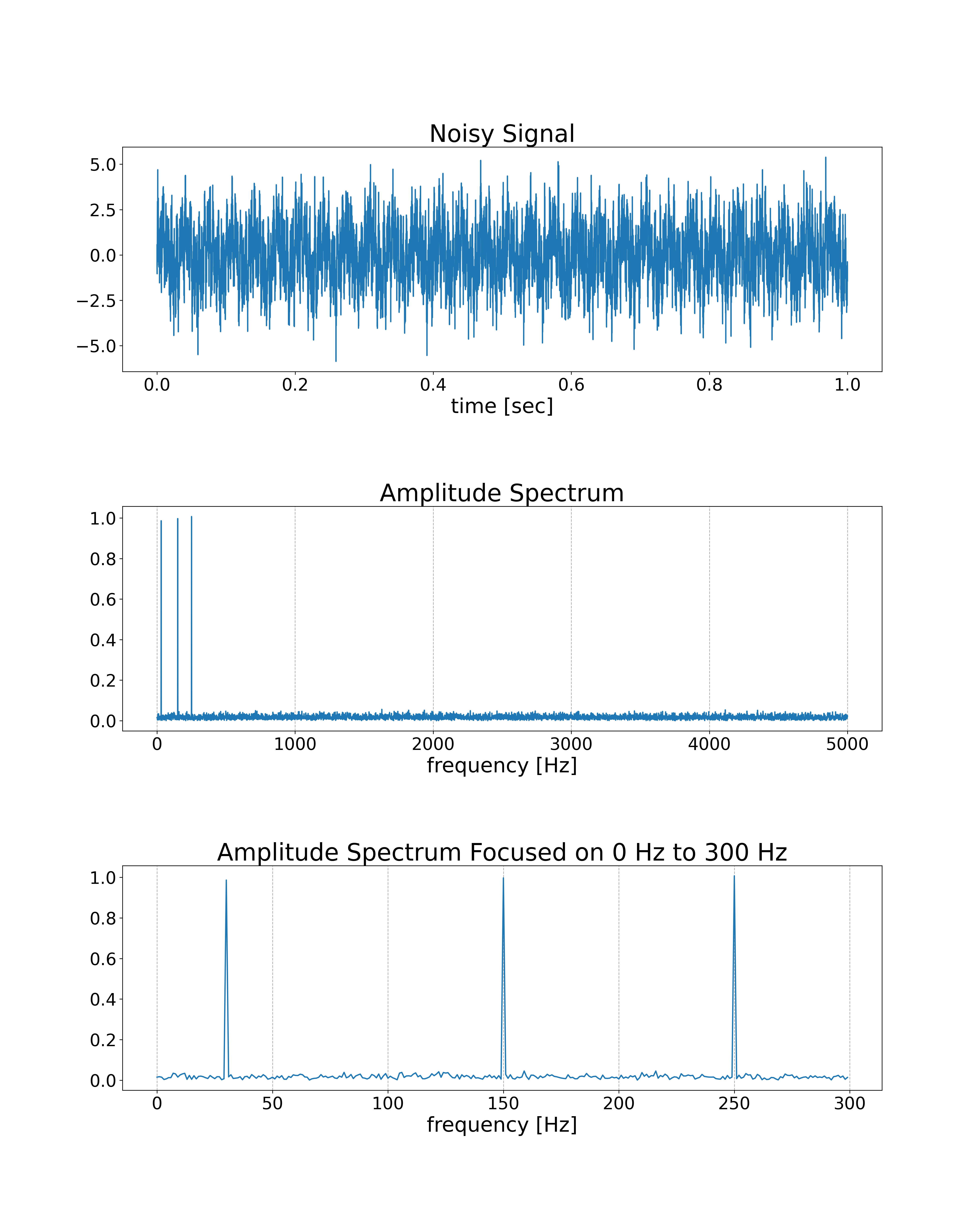
We will analyze a spectrum of the noisy signal by using FFT. The input signal contains 30Hz, 150Hz, and 250Hz sine waves and normally distributed random numbers.
Program
import nlcpy as vp
from matplotlib import pyplot as plt

N  = 10000   # The number of samples
DT = .0001   # The time step interval
FREQS = [    # The list of frequencies to include in the signal
    30,
    150,
    250
]


def gen_signal():
    T = vp.arange(0, N * DT, DT, dtype='f8')
    S = vp.zeros(N, dtype='f8')
    for f in FREQS:
        S += vp.sin(2 * vp.pi * f * T)
    # Add noise
    S += vp.random.randn(N)
    return T, S


def analyze(S):
    A = vp.absolute(vp.fft.rfft(S)) / N * 2
    F = vp.fft.rfftfreq(N, d=DT)
    return A, F


def gen_graph(T, S, A, F):
    fig, axes = plt.subplots(3, 1, figsize=(16, 20))
    axes[0].set_title('Noisy Signal', fontsize=28)
    axes[0].plot(T, S)
    axes[0].set_xlabel('time [sec]', fontsize=24)
    axes[0].tick_params(labelsize=20)

    axes[1].set_title('Amplitude Spectrum', fontsize=28)
    axes[1].plot(F[:], A[:])
    axes[1].set_xlabel('frequency [Hz]', fontsize=24)
    axes[1].grid(axis='x', linestyle='--')
    axes[1].tick_params(labelsize=20)

    axes[2].set_title('Amplitude Spectrum Focused on 0 Hz to 300 Hz', fontsize=28)
    axes[2].plot(F[:300], A[:300])
    axes[2].set_xlabel('frequency [Hz]', fontsize=24)
    axes[2].grid(axis='x', linestyle='--')
    axes[2].tick_params(labelsize=20)

    plt.subplots_adjust(hspace=0.6)
    plt.savefig('spectrum.png', dpi=300)


if __name__ == '__main__':
    T, S = gen_signal()
    A, F = analyze(S)
    gen_graph(T, S, A, F)
Result